I realized that with all my various photoshoot blogs, I’ve always only shown the raw image. Now, I like to this for a couple reasons. First, it shows what you can realistically capture, without any of the editing magic you usually see in photographers’ published works. Second, it more accurately captures the actual elements of the shoot, like location, traffic, and natural lighting. Edits generally change the natural elements of a shoot location. And thirdly, being totally transparent, it’s a lot faster to upload a photoshoot blog if I deal with only the raw photos rather than having to export them, edit them, then reimport them, and then writing the blog.
But I do want to show you all how I like to edit my pictures. I think it’s rather simple, and the method I use right now is free and available for everyone to use. I use the app VSCO on my phone, and have been for a while.
If you’re unfamiliar with VSCO, it’s an editing and photo sharing app. You can favorite and reblog photos from creators you like and follow feeds, much like Tumblr, but what most people use the app for is its simple editing tools. It does come with free presets, and with a membership you can access some other (admittedly pretty cool) presets as well. I don’t have said membership, and honestly don’t really like using the presets too often, but their other editing tools are pretty cool.
While I do want to become better versed in Photoshop and Lightroom eventually, VSCO is definitely a tried and true simple way to do edits. I recently did a blue themed self-portrait shoot, so today I’m going to walk through some of the edits I did for a couple different pictures.
I tend to use the same main edits, just at different degrees depending on the specific picture. As a reference point, these are Exposure, Contrast, Adjust, Sharpen, Saturation, White Balance, and Skin Tone. There are a couple others to play around with as well.
I’m going to show three different edits I did, based on the different compositions of the photos. So without further ado, let’s get to the edits.
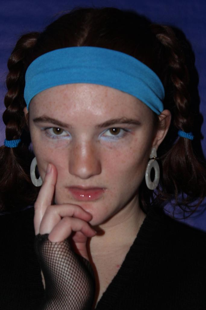
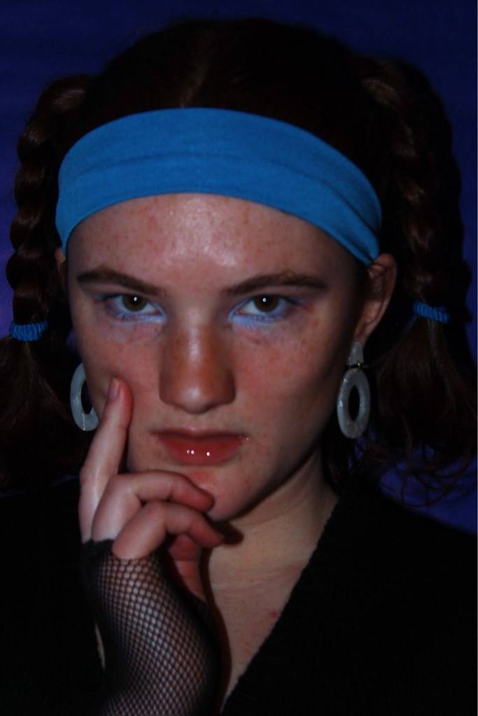
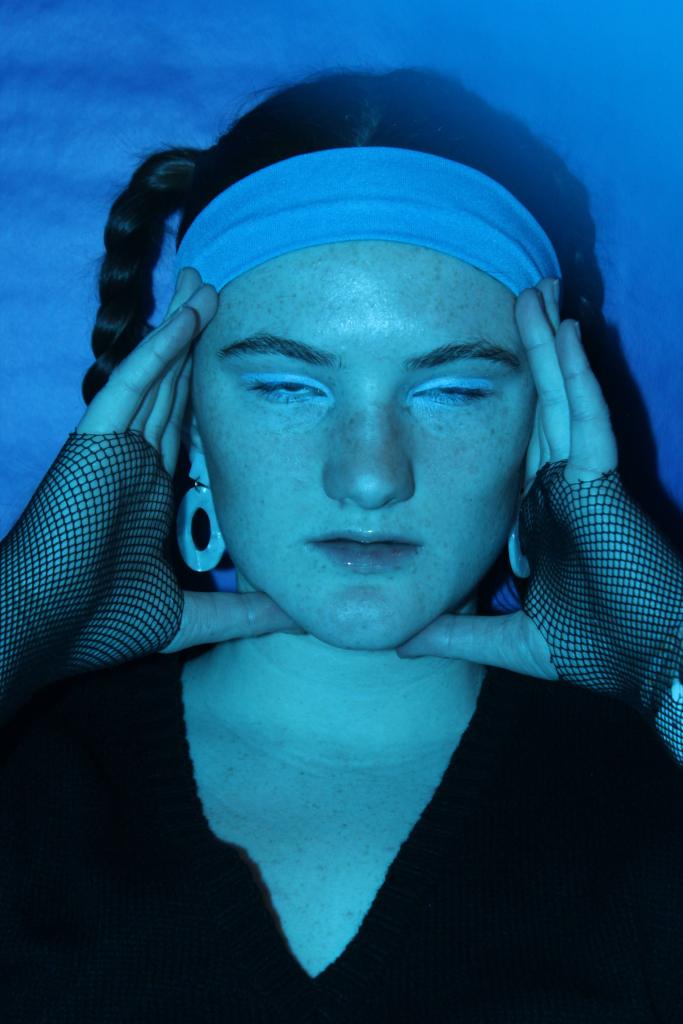
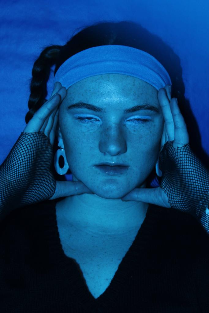
I already liked this picture, but I wanted to enhance a couple elements of it. The main thing, since the theme of the photoshoot was “blue”, was that I wanted to make sure the blues popped more, especially the blue eyeshadow.
The other edits I applied were the usual ones I did. First, I went to Exposure and Contrast. I always start there, to give my photo a good base. If you do those at the end, you may have to redo your other edits. I started by lowering the exposure to -2.6, which darkened it and added more depth to the shadows. Then, to counteract that and keep balance to the photo, I upped the contrast to +2.4. I also decided to increase the sharpness to +3.0 on Sharpen, which is something I don’t do too often, but I really liked the effect it gave.
Next, I wanted to emphasize the blues in the photo. I went to Saturation, and changed it to +1.6. However, I then needed to do some color correction, since it also increased the saturation of some colors I didn’t want to emphasize. So, I went to White Balance and changed Temperature to -1.3, but left the Tint alone. Lastly, since I wanted to get rid of some of the red hues without increasing green hues (like you can with Tint), I went to Skin Tone and changed it to +2.1.
The result is on the left, and I really love it! The edits aren’t crazy, but just enough.
I had a couple photos with similar lighting and composition as the one above, so I did similar edits. However, this next photo has a very different lighting situation. The half-light, half-dark shadows meant some differences in edits, but I’ll list out the changes I made to this photo below:
- Exposure: -3.3
- Contrast: +3.1
- Sharpen: +3.0
- Saturation: +1.1
- White Balance (Temperature): -0.9
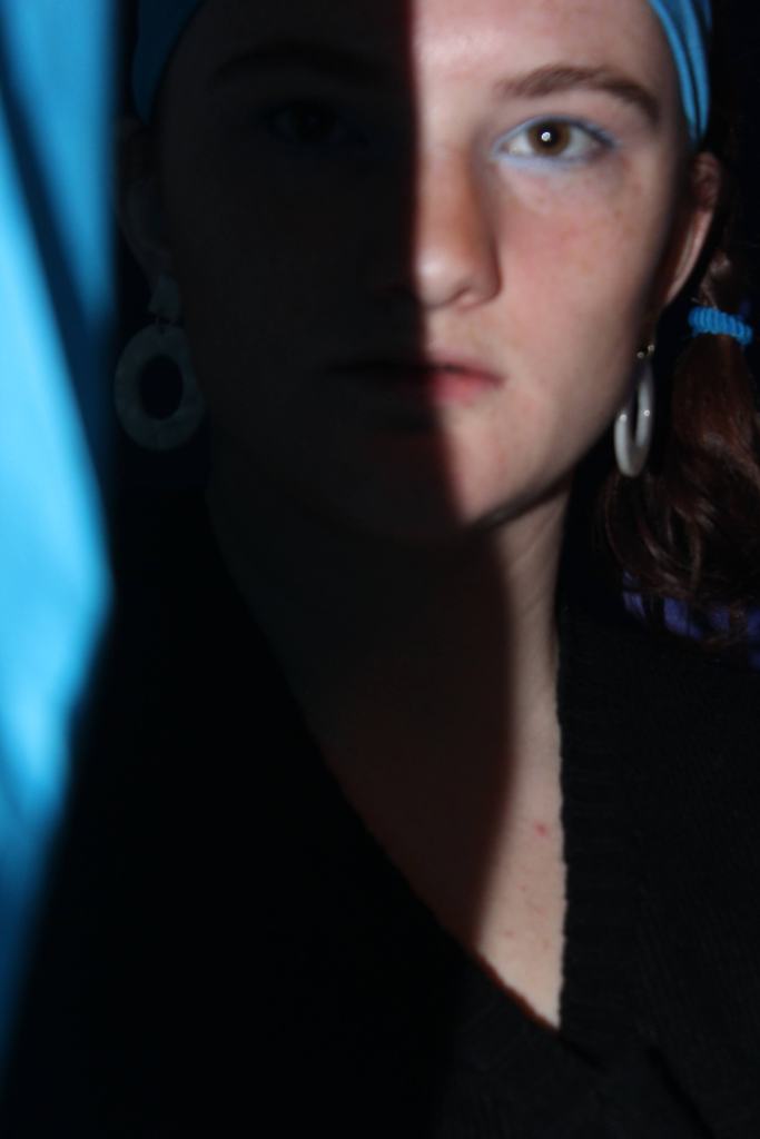
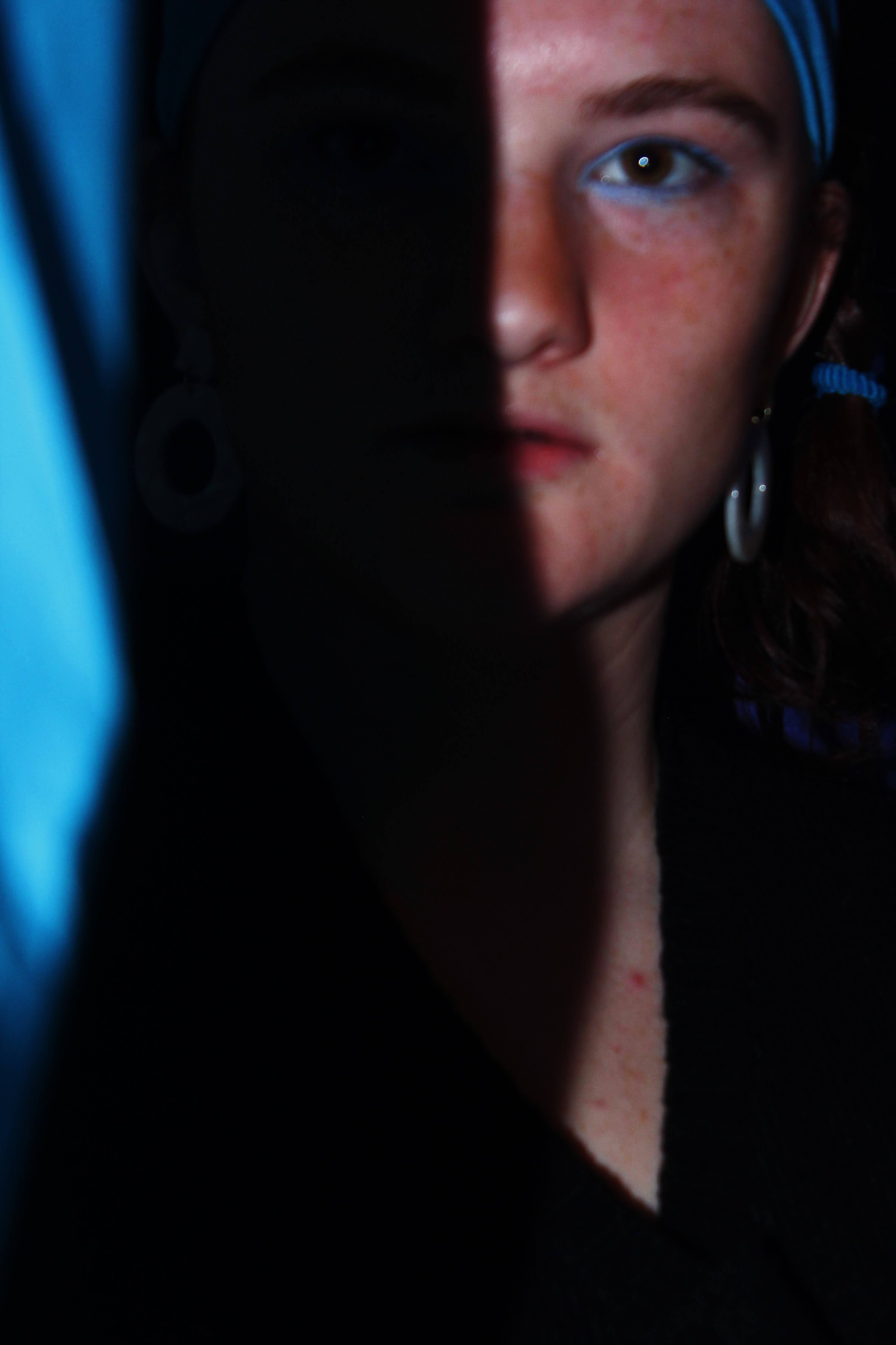
With those edits, I was able to emphasize both the blues and the shadow contrast, while not making my face look too stylized or over edited. The second photo is the final result of those edits.
The last type of photo I had to edit were the ones with blue lighting. I achieved the blue lighting by overlaying my flash with some blue tissue paper, a complete accident at first. I loved the effect and decided to take some actual pictures with the blue lighting, but it definitely required some different edits. The left image is the original, and the right is the final edited version.
The blue light photos I still wanted to darken the photo a bit and increase the contrast, but emphasizing the blue was much more important to me because the entire picture was blue. I had to make sure that it was the right shade of blue on top of being able to notice the blue. One effect of the colored flash is that the blue light tinted sort of green, so I had to fix that in edits. Here’s a list of the edits I made to my blue-lit pictures:
- Exposure: -3.1
- Contrast: +1.7
- Saturation: +0.8
- White Balance (Temperature): -1.7
- White Balance (Tint): +1.2
The only other edit that I didn’t really address was the Adjust tool. In this tool, you can crop, straighten, x-skew, and y-skew your photo. I generally stay away from the skew function. However, the Crop + Straighten function is a great friend of mine. I’ll always start a photo edit off with cropping or straightening the photo if needed, and then heading into Exposure and Contrast.
I hope this process helps you find your editing style! There are so many different ways you can edit, and many different programs you can edit with. It may take some experimenting, but eventually you’ll find a style and fall in love with it.
I will continue to post my unedited photos in my photoshoot blogs, but will likely come back around again every now and then with a before-and-after look at my edited photos. And as always, you can follow my Instagram if you’d like a look at my finished photos. Until next time!
